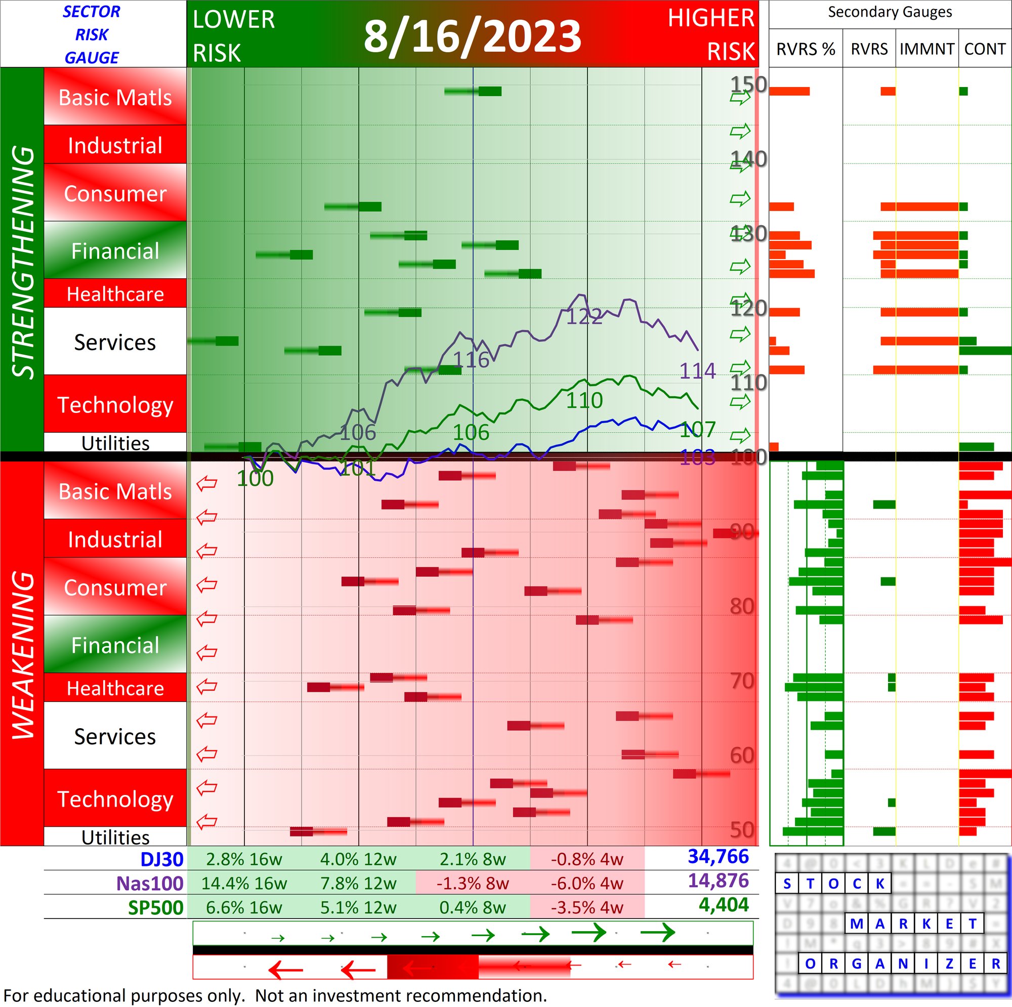
Sector Risk Gauge 2023-08-16 (with preceding 8 weeks context)
Did you know? The U.S. stock market has transitioned from strengthening to weakening over the past 8 weeks as graphically shown by the emotion- and confusion-killing Sector Risk Gauge (SRG). Link to download the report:
The current 8/16/23 reading is shown after 8 weekly Friday readings starting 6/23/23. Instructions are at the bottom of this post.
Q1: What is the SRG?
A1: A bounded, objective measurement of prevailing market risk. "Bounded" means you can see how high is "high" and how low is "low."
Q2: What problem does this solve?
A2: It helps you determine what to do in the market. You can
🔹 (generally) objectively understand how market tides are rising or falling and
🔹 (specifically) compare current risk versus important bottoms (such as 3/23/20 Covid and 3/9/09 GFC) to better gauge when to be conservative or aggressive.
Q3: Who cares?
A3: You, IF you have any belief that rising tides lift all boats. I do, as noted in this post.
Q4: What makes this better than price charts?
A4: Price charts
🔹 can be distorted (consider recent Magnificent 7 influence on market cap-weighted indexes),
🔹 hide underlying detail (cannot show helpful critical sector- and industry-level strength detail), and
🔹 aren't bounded (per A1 answer above, cannot tell you how high is high and how low is low).
The Sector Risk Gauge
🔹 reveals current risk levels across sectors and industries and
🔹 fosters meaningful comparisons to previous market bottoms.
Q5: How is this different than a heat map?
A5: A heat map = a single-day snapshot offering zero helpful context.
SRG = an on-going movie created to provide context.
Q6: Does the SRG have anything to do with predictions, feelings, discretion, interpretations, emotions, or bias?
A6: No. It is 100% objective.
INSTRUCTIONS:
◻ Each bar shows industry risk.
◻ An industry bar will be either green (the industry is strengthening and shown in the upper half of the graphic) or red (weakening, lower half).
◻ Green bars move left to right, red right to left.
◻ The farther left the bar, the lower the relative risk.
◻ Thus, a green industry bar at the far left is early in its strengthening, and a red industry bar at the far left is late in its weakening.
◻ There is no requirement that a strengthening/weakening industry bar travel the full length left to right/right to left. They can reverse at any time.
◻ Better times to buy are when all bars are red and clustered to the left. #notaninvestmentrecommendation